
15+ years building for the web
Responsive web design.
Websites that look sharp and work smoothly on every screen, from a 27-inch monitor to the phone in your customer's pocket. Designed around your business, built to load fast and set up to be found on Google.






The basics
What is responsive web design?
A responsive website adapts its layout to the screen it is viewed on. Text stays readable, buttons stay easy to tap and images resize, whether someone visits on a laptop, a tablet or a phone.
Most people now find and judge a business on their phone first. If your site is hard to use on a small screen, visitors leave before they ever get in touch. Google also looks at the mobile version of your site when it decides how to rank it.
We design every page for small screens first and scale up from there, so the mobile experience is never an afterthought.
Are you looking for a website that:
Let's talkLooks professional and current
A design that reflects the quality of your work and makes a strong first impression.
Works on every device
Clear, readable and easy to use on phones, tablets and desktops alike.
Loads fast
Lean pages, optimised images and solid hosting, so visitors are not left waiting.
Is easy to update
Change texts, images and pages yourself, without calling a developer for every edit.
Brings in enquiries
Clear calls to action and a structure built to turn visitors into customers.
How we work
From first call to launch and beyond.
One team handles the whole project, so nothing gets lost between designer, developer and marketer.
Discover
We learn how your business works, who your customers are and what the website needs to achieve.
Design
We design the key pages for mobile and desktop, and refine them with you until they feel right.
Build
We build the site on a fast, secure foundation, with SEO basics and analytics set up from day one.
Launch and grow
We test on real devices, go live and keep improving the site with care plans, SEO and ads.
Client results
Your site goes live.
Then it starts to grow.
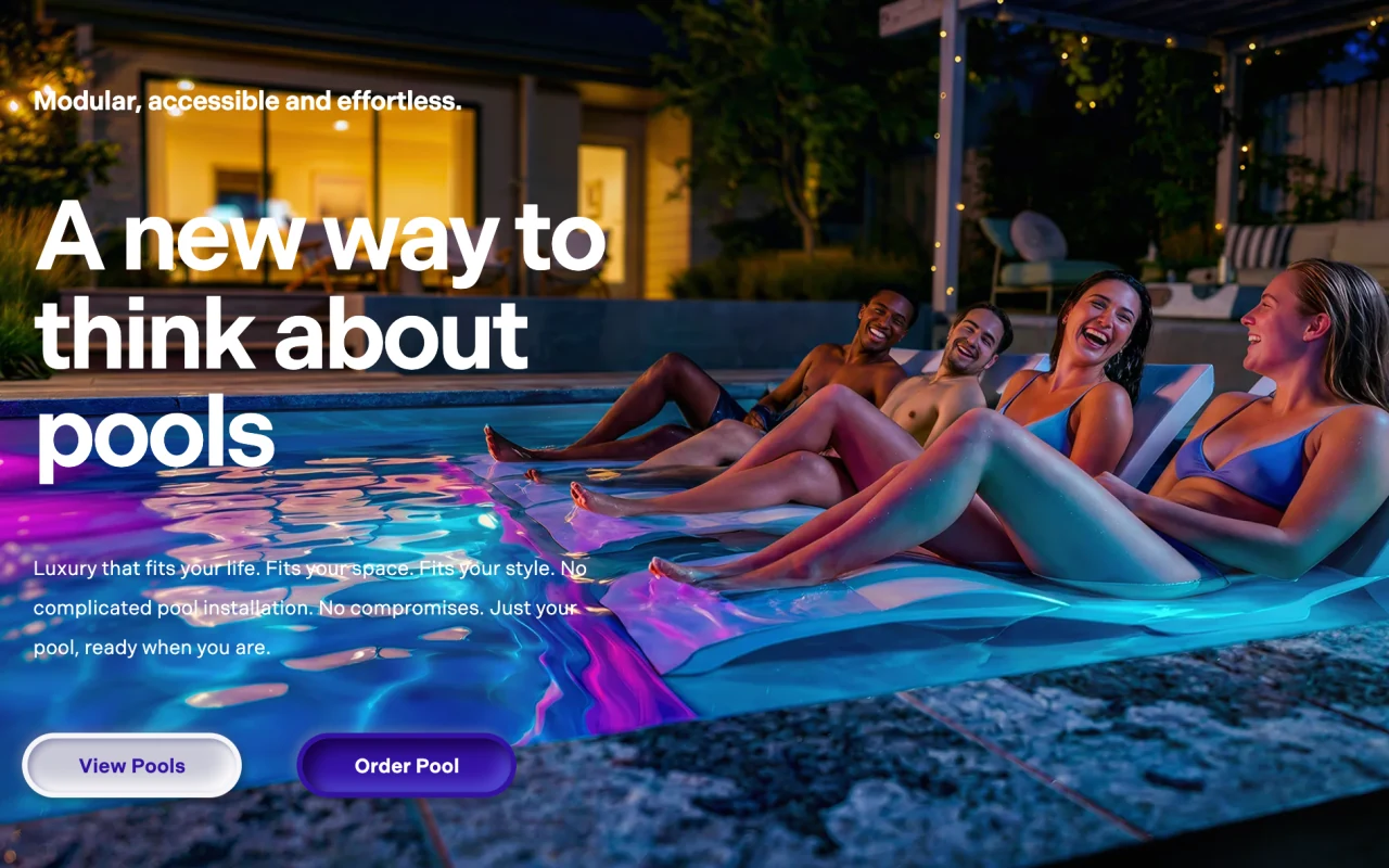
- nexuspools.com.au

- dinerspel.nl
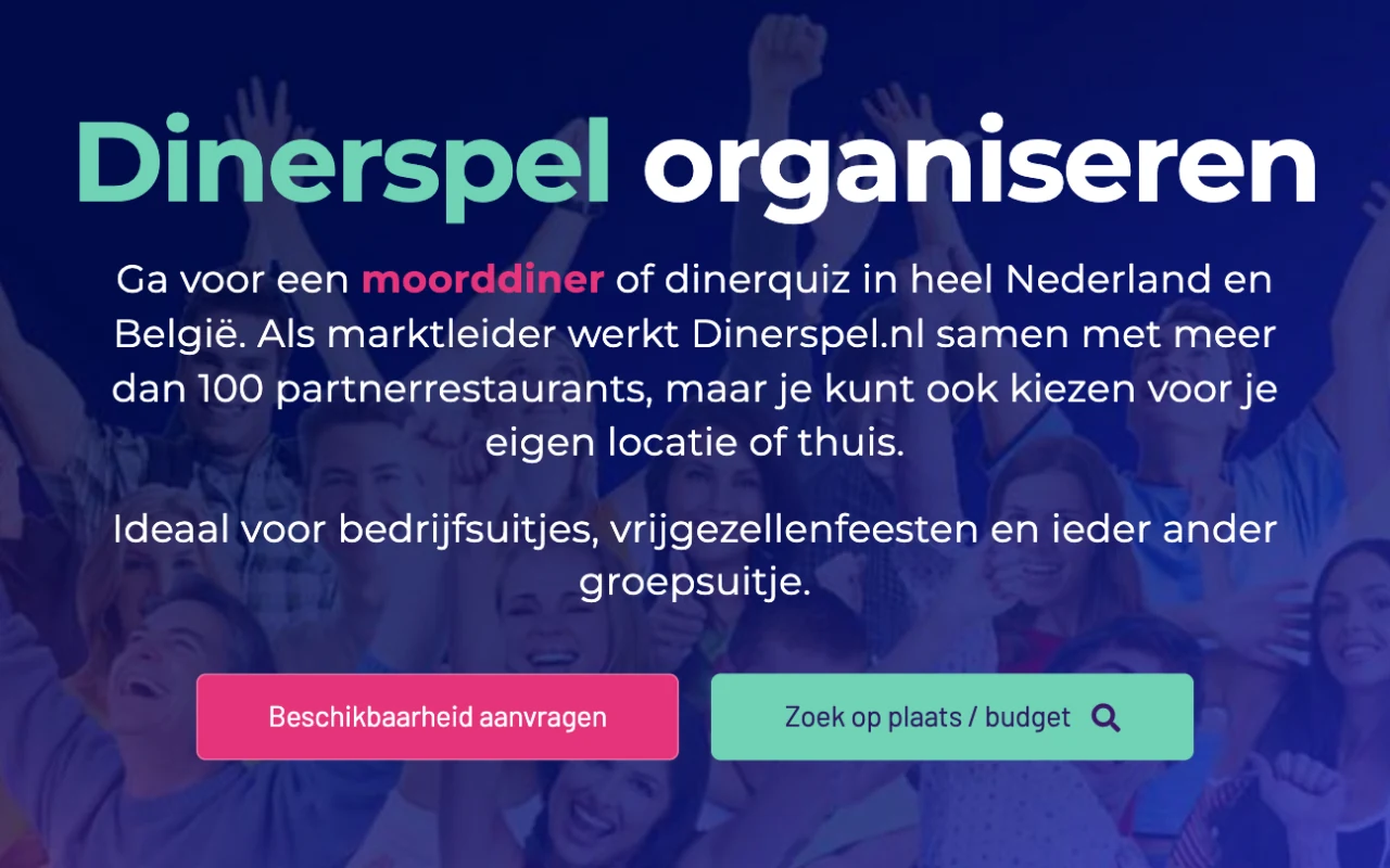
100+
Partner restaurants across two markets, supported by one WordPress and Airtable system
DinerspelRead the study - novuspools.com
Client reviews
Jan’s guidance to our global organization has been invaluable. It is to his credit that we are able to be a leader in our industry in the digital field.
Technology
Proven tools, modern technology.
We pick the platform that fits your goals and budget, not the other way around. Every option is fast, secure and easy for you to manage.
WordPress
Flexible, widely supported and easy to edit. Our go-to for most business websites, with custom fields so content stays structured.
Next.js
For projects that need maximum speed or custom functionality, like the site you are looking at now.
WooCommerce
Online stores that sit right inside your WordPress site, from a handful of products to a full catalogue.
AI-assisted workflows
We use AI tools to speed up development, testing and content work, so more of your budget goes into the result.
Why Digtiz
A full-service web agency in Alicante.
Design, build and growth in one place
Web design, development, SEO, ads and maintenance from one team that knows your site inside out.
Clear communication
You always know where your project stands, what comes next and what it costs.
Built to last
Clean code, solid hosting and ongoing care, so your site keeps performing long after launch day.
It is a way of designing websites so the layout adapts to the screen size. The same site rearranges itself to stay readable and easy to use on a phone, a tablet or a desktop.
Often, yes. Depending on how your site is built, we can update the existing theme or rebuild the front end. If the site is outdated in other ways too, a new build is usually the better investment. Ask us to take a look.
Open it on your phone and try the key tasks: read a page, find your contact details, fill in a form. On a desktop, make the browser window narrow and see whether the layout adapts or starts to break.
Yes. Google mainly uses the mobile version of your site to decide how it ranks, and a site that is easy to use on a phone keeps visitors around longer. Speed matters too, which is why we build lean pages.
No. Every site is designed around your business, your customers and your goals, so it looks and works the way you need.